/login/
Overview
The Page Design interface in the Zequenze CONTROL Portal allows administrators to customize the visual appearance and functionality of portal pages. This specific view shows the configuration page for a login page (/login/) where administrators can modify design elements, system variables, and page behavior through an intuitive interface with real-time preview capabilities.
Key Features
- Real-time Preview: Live preview of page changes displayed on the right side of the interface
- Variable Management: Configure both generic and system variables that control page behavior
- Visual Customization: Modify background images, colors, and other visual elements
- Responsive Design: Preview shows how the page appears to end users
- Template Integration: Support for sponsored templates and custom branding
UI Elements
Left Panel - Configuration Area
-
Generic Variables Section:
- Background image selector with dropdown menu and upload button
- Background color picker with color selection field
- Banner UUID field for custom banner configuration
-
System Variables Section:
- Welcome URL configuration field with expansion button for additional options
- Download App URL specification field with expansion button for detailed configuration
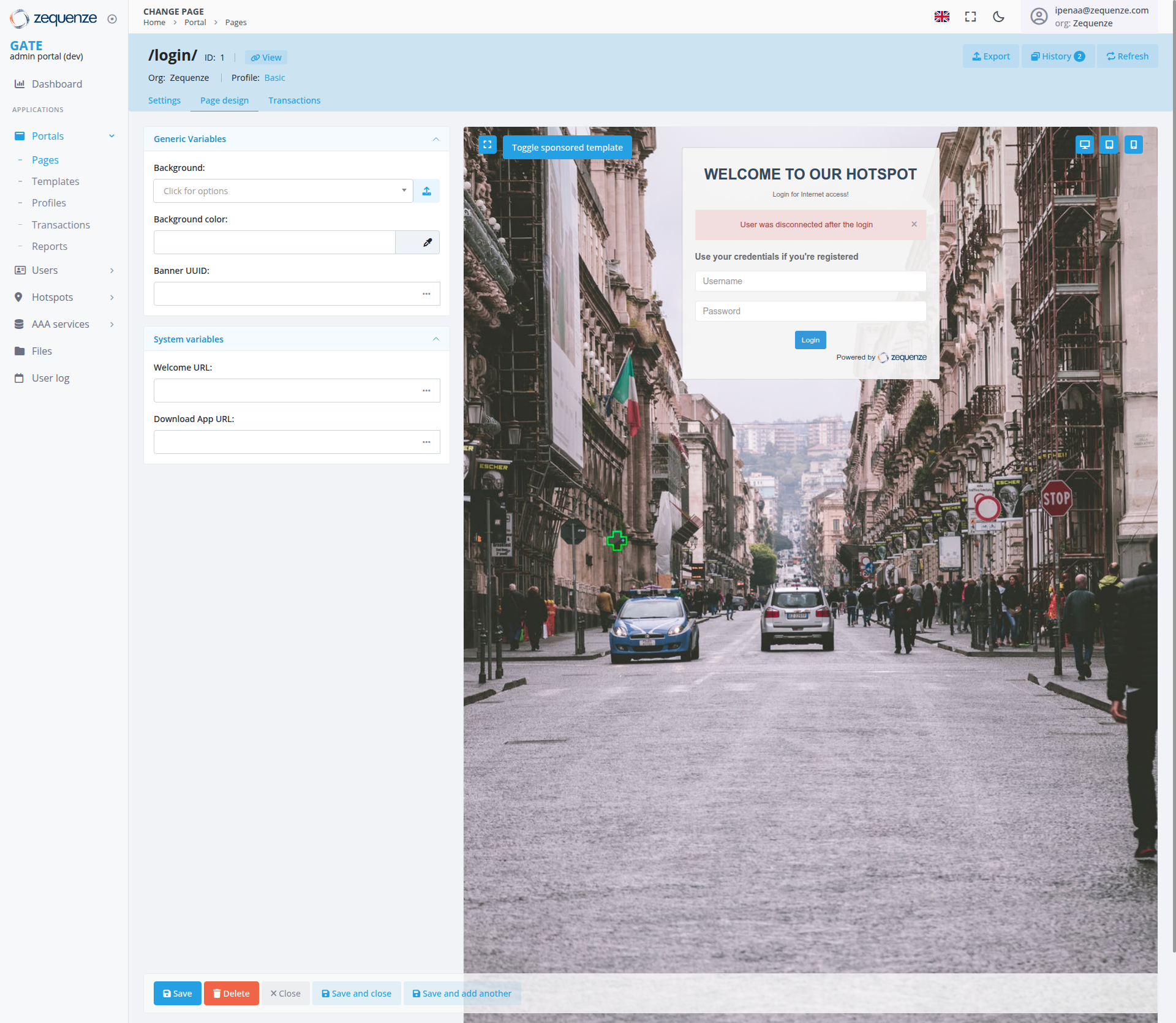
Right Panel - Live Preview
- Page Preview: Real-time display of the configured login page
- Hotspot Interface: Shows "WELCOME TO OUR HOTSPOT" header with "Login for Internet access!" subtitle
- User Notification: Red error message stating "User was disconnected after the login"
- Login Form: Username and password fields with blue "Login" button
- Registration Option: "Use your credentials if you're registered" text above login fields
- Background: Urban street scene with cars and European architecture featuring historic buildings and pedestrians
- Branding: "Powered by Zequenze" footer attribution
- Template Toggle: Blue "Toggle sponsored template" button prominently displayed in the top-left corner of the preview
-
Preview Controls: Three icon buttons positioned in the top-right corner of the preview area:
- Comment/message icon button
- Display/monitor icon button
- Bookmark/save icon button
Navigation Tabs
- Settings: Available for general page configuration
- Page Design: Current active tab highlighted in blue for page configuration
- Transactions: Transaction-related settings
User Interactions
- Customize Background: Click the background dropdown to select from available images or use the upload button to add custom backgrounds
- Color Selection: Use the color picker interface to modify background colors and theme elements
- URL Configuration: Enter custom URLs for welcome pages and app downloads in the system variables section, with expansion buttons available for additional options
- Real-time Preview: Changes made in the left panel immediately reflect in the right preview panel
- Template Toggle: Use the "Toggle sponsored template" button visible in the top-left corner of the preview area to switch between template modes
- Preview Controls: Use the three icon buttons in the top-right corner of the preview area to access comments, display options, or bookmarking features
Navigation
Data Displayed
- Page Information: Shows page ID (1) and current view mode
- Profile: Displays "Basic" profile configuration
-
URL Structure: Shows the page path (
/login/) - Variable Values: Current settings for background, colors, and system URLs
- Preview State: Live representation of how the page appears to end users including error messages and user notifications
Actions Available
Primary Actions (Bottom Bar)
- Save: Apply changes without closing the editor (blue button)
- Delete: Remove the current page configuration (red button)
- Close: Exit the editor without saving changes (gray X button)
- Save and close: Apply changes and return to the previous view (blue button)
- Save and add another: Save current changes and create a new page (blue button)
Secondary Actions (Top Bar)
- Export: Download page configuration
- History: View change history and version control (with notification badge showing "2")
- Refresh: Reload the current configuration
Notes/Tips
- Background Images: Ensure uploaded images are web-optimized for faster loading times. Use the upload button next to the background selector for custom images
- Color Customization: Use the color picker interface for selecting theme colors and visual elements
- URL Configuration: Use the expansion buttons next to URL fields to access additional configuration options and detailed settings
- URL Validation: System validates URLs entered in the Welcome URL and Download App URL fields
- Auto-save: The system may automatically save changes, but manual saving is recommended
- Preview Accuracy: The preview panel provides an accurate representation of the end-user experience including error states and notifications
- Template Compatibility: Some customizations may be limited when using sponsored templates
- Mobile Responsiveness: Consider how design changes will appear on different device sizes
- Error Messages: The preview shows real-time status messages that users will see, including disconnection notifications
- Template Testing: Use the toggle sponsored template feature in the top-left corner to preview how the page appears with and without sponsored content
- Preview Controls: Utilize the preview control icon buttons in the top-right corner for accessing comments, display options, and bookmarking functionality
No comments to display
No comments to display