Results: Traffic per AP (GBytes)
Overview
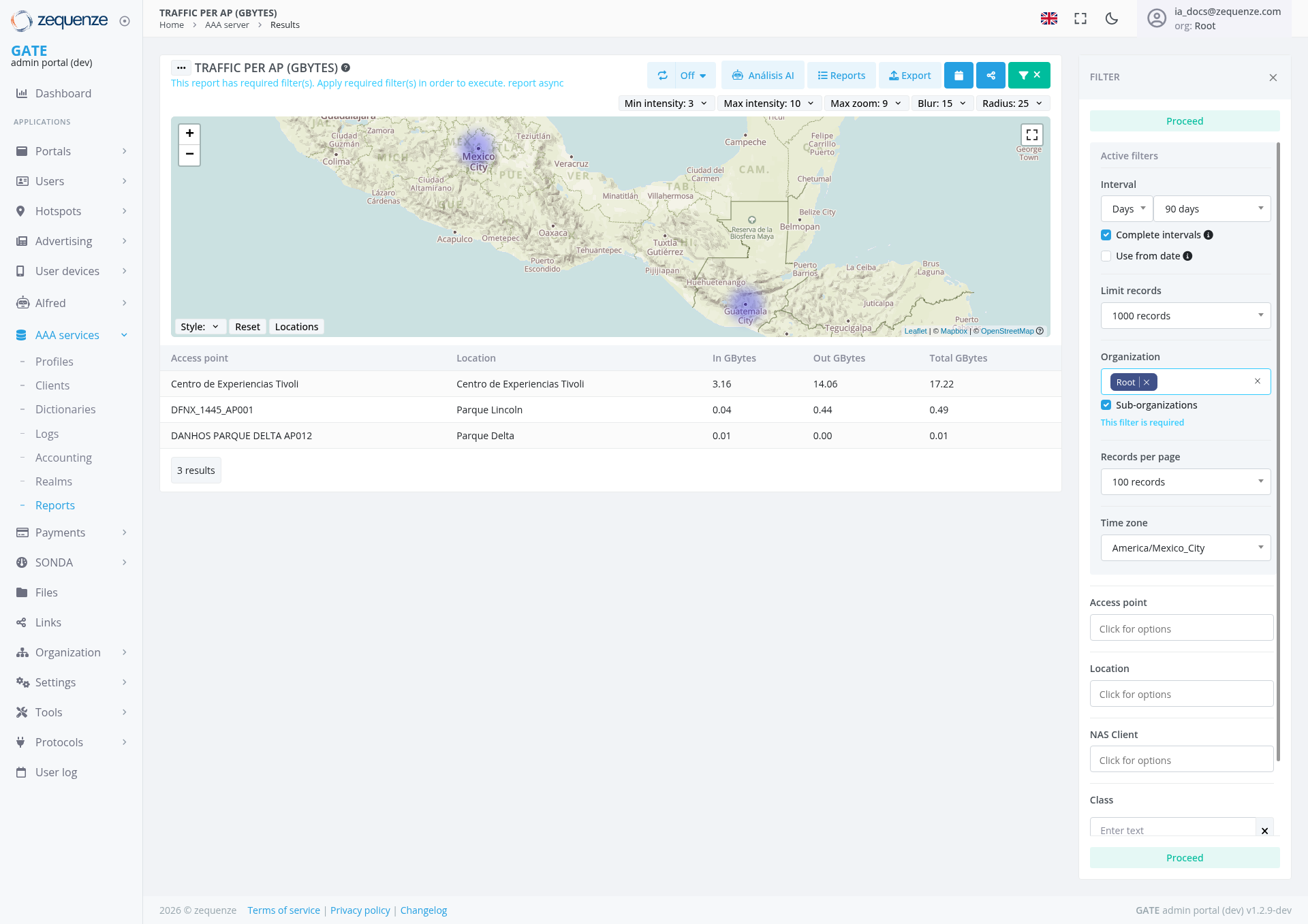
The Traffic per AP (GBytes) report provides a comprehensive view of data traffic usage across Access Points (APs) in your network infrastructure. This report displays both incoming and outgoing traffic data measured in gigabytes, with an interactive map visualization and detailed tabular data for network traffic analysis.
Key Features
- Interactive Map Visualization: Geographic representation of access points with traffic intensity overlays
- Real-time Traffic Monitoring: Displays current traffic data with configurable refresh intervals
- Customizable Time Periods: Filter data by specific date ranges (currently set to 90 days)
- Traffic Analysis: Separate columns for incoming, outgoing, and total traffic measurements
- Export Capabilities: Options to export data and generate reports
- Advanced Filtering: Multiple filter options for detailed data analysis
UI Elements
Map Controls
- Zoom Controls: Plus (+) and minus (-) buttons for map navigation
- Fullscreen Toggle: Expand map to full screen view
- Style Selector: Change map visualization styles
- Reset Button: Return to default map view
- Locations Toggle: Show/hide location markers
Top Control Bar
- Min intensity: Adjustable setting (currently set to 3)
- Max intensity: Adjustable setting (currently set to 10)
- Max zoom: Zoom level control (currently set to 9)
- Blur: Visual effect adjustment (currently set to 15)
- Radius: Coverage area radius (currently set to 25)
- Off Toggle: Option to disable certain display features
- Analysis AI Button: AI-powered analytics functionality
- Reports Button: Access to report generation
- Export Button: Data export functionality
- Additional Action Buttons: Green action buttons with icons for advanced functionality
Filter Panel (Right Side)
Data Table
- Access Point Column: AP names and identifiers
- Location Column: Physical location of each access point
- In GBytes: Incoming traffic data
- Out GBytes: Outgoing traffic data
- Total GBytes: Combined traffic totals
User Interactions
Map Visualization Controls
- Adjust Min intensity and Max intensity sliders to control heatmap sensitivity
- Modify Max zoom level for detailed geographic focus
- Change Blur and Radius settings to customize visualization appearance
- Use Off toggle to disable specific display elements
- Access Analysis AI functionality for intelligent traffic pattern insights
- Use Reports and Export functions from the top control bar
- Utilize additional green action buttons for enhanced functionality
Filtering Data
Map Navigation
- Use zoom controls to focus on specific geographic areas
- Click locations on the map to view detailed AP information
- Toggle between different map styles for better visualization
- Use fullscreen mode for detailed geographic analysis
Data Export
- Click the Export button in the top control bar to download current data set
- Use Reports option to generate formatted reports
- Use Analysis AI for automated insights and pattern recognition
- Access additional functionality through the green action buttons
Navigation
Data Displayed
The report shows traffic data for three locations:
Current Locations
- Centro de Experiencias Tívoli: 3.16 GB incoming, 14.06 GB outgoing (17.22 GB total)
- Parque Lincoln: 0.04 GB incoming, 0.44 GB outgoing (0.49 GB total)
- Parque Delta: 0.01 GB incoming, 0.00 GB outgoing (0.01 GB total)
Traffic Metrics
- Incoming Traffic: Data received by each access point
- Outgoing Traffic: Data transmitted from each access point
- Total Traffic: Combined incoming and outgoing data
- 3 Results: Currently displaying 3 access points total
Actions Available
Data Management
- Filter Results: Apply various filters to refine data display using the Proceed buttons (one at the top of the filter panel for general settings, and one at the bottom for class filtering)
- Export Data: Download traffic data using the Export button in top control bar
- Generate Reports: Create formatted reports using the Reports button
- AI Analysis: Leverage artificial intelligence for traffic pattern analysis using the Analysis AI button
- Advanced Actions: Access additional functionality through the green action buttons in the top control bar
- Refresh Data: Update display with latest traffic information
Visualization Options
- Map Customization: Adjust intensity (3-10), zoom (9), blur (15), and radius (25) settings via top controls
- Style Changes: Modify map appearance and data representation
- Time Range Adjustment: Change reporting periods for trend analysis
- Display Controls: Use Off toggle to disable specific visual elements
Notes/Tips
- AI-Powered Insights: Use the Analysis AI button for automated traffic pattern analysis and recommendations
- Filter Application: Use the Proceed buttons to apply filter changes after making selections - one at the top of the filter panel for general filters, and one at the bottom specifically for class filtering
- Record Limits: Maximum of 1000 records can be retrieved, with 100 records displayed per page
- Data Completeness: Enable "Complete intervals" and "Use from date" for more accurate reporting
- Geographic Context: Use the map view with customizable intensity and radius settings to understand traffic patterns by location
- Traffic Patterns: Monitor both incoming and outgoing traffic for comprehensive analysis
- Time Zone Awareness: Ensure correct time zone setting for accurate temporal analysis
- Performance: Limit records per page for better system performance with large datasets
- Visual Customization: Adjust blur, radius, and intensity settings for optimal heatmap visualization
- Enhanced Functionality: Explore the additional green action buttons for expanded capabilities
Best Practices
- Use the appropriate Proceed buttons to ensure filter changes are properly applied (top button for general filters, bottom button for class filters)
- Leverage the Analysis AI functionality for automated insights and anomaly detection
- Regularly monitor high-traffic access points for capacity planning
- Adjust map visualization controls (intensity, blur, radius) for clearer pattern identification
- Use geographic visualization to identify coverage gaps or hotspots
- Export data for historical trend analysis and reporting
- Apply appropriate filters using the dropdown options to focus on specific network segments or time periods
- Utilize the additional action buttons in the top control bar for enhanced functionality and workflow optimization